This project started by focusing on the experiential design in their flagship location. Developing wall patterns and textures for the space. From these initial elements, the client asked me to pull everything together with a full brand standards document, outlining the color palette, font library, patterns and usage standards, etc. The only element out of my scope on this project was the logo.
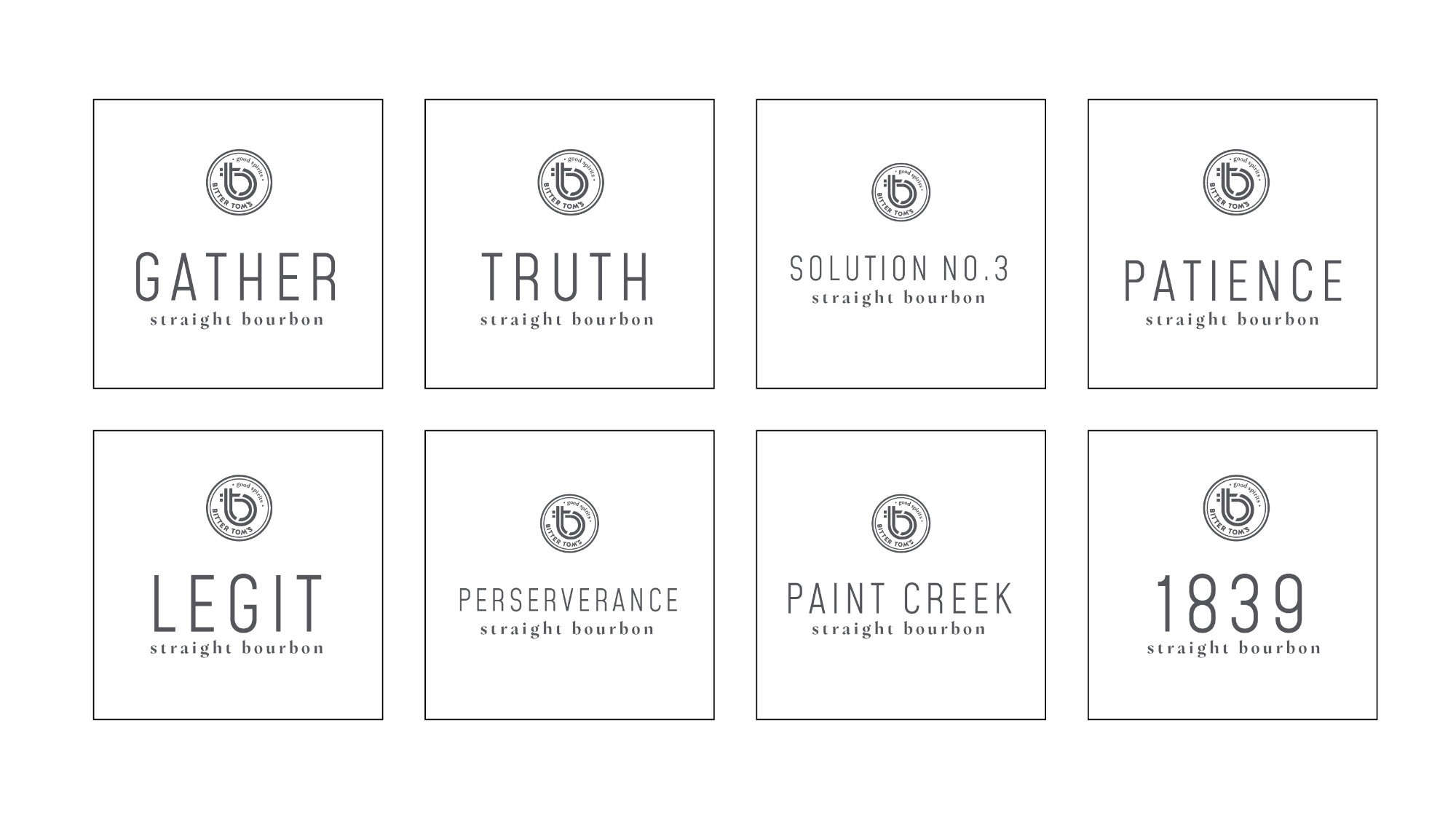
Once the standards were created we started to apply them to their bottle labels. This included multiple product-level naming strategy sessions and developing the messaging language appropriate for the brand.
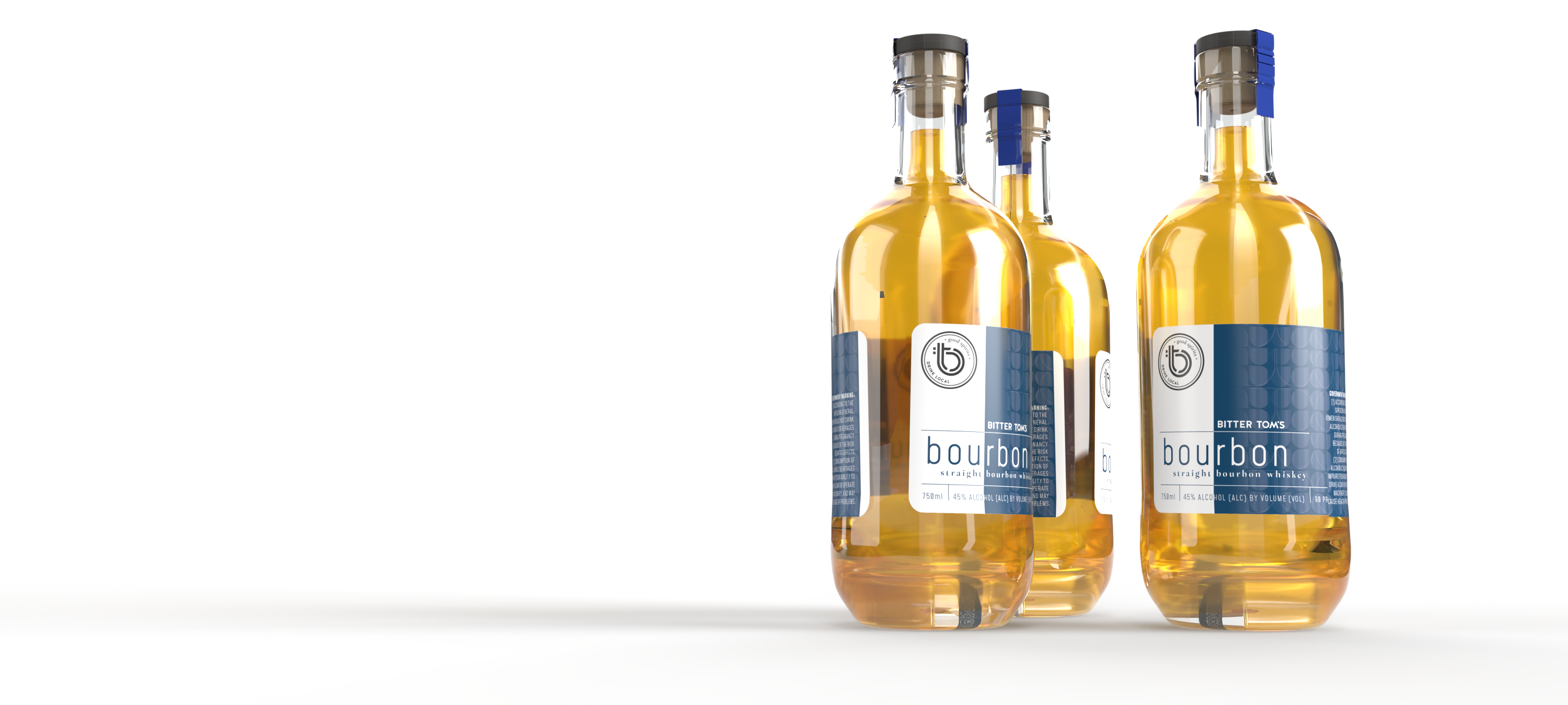
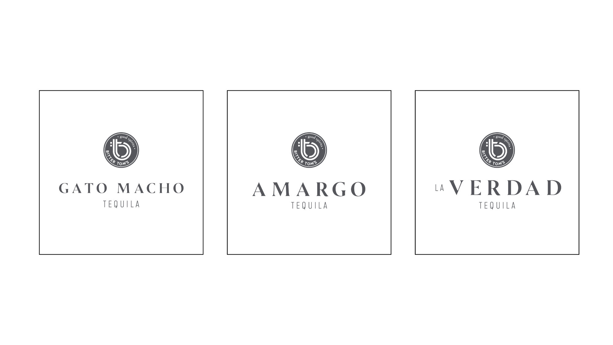


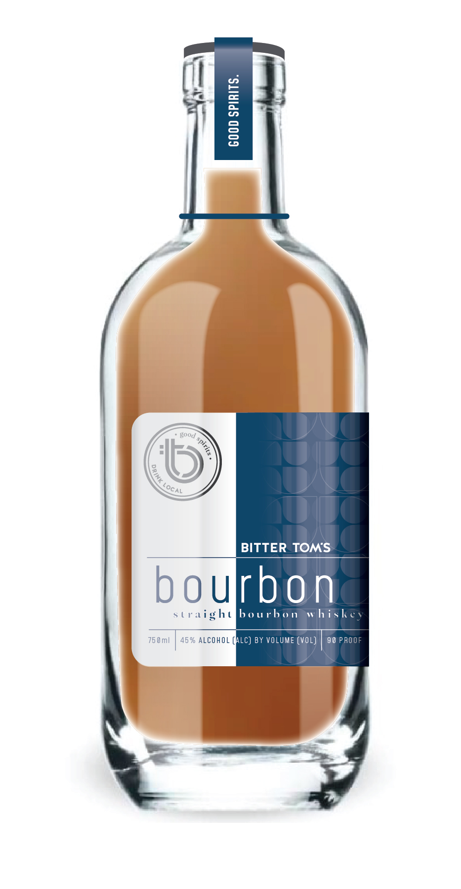
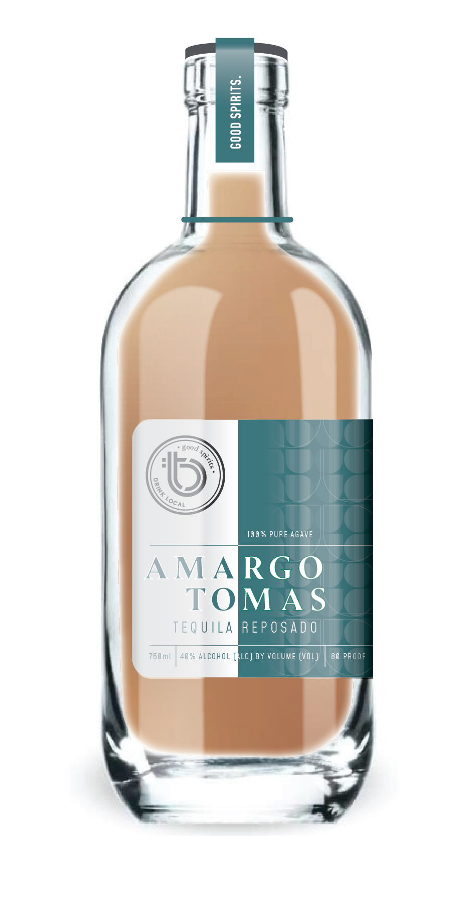
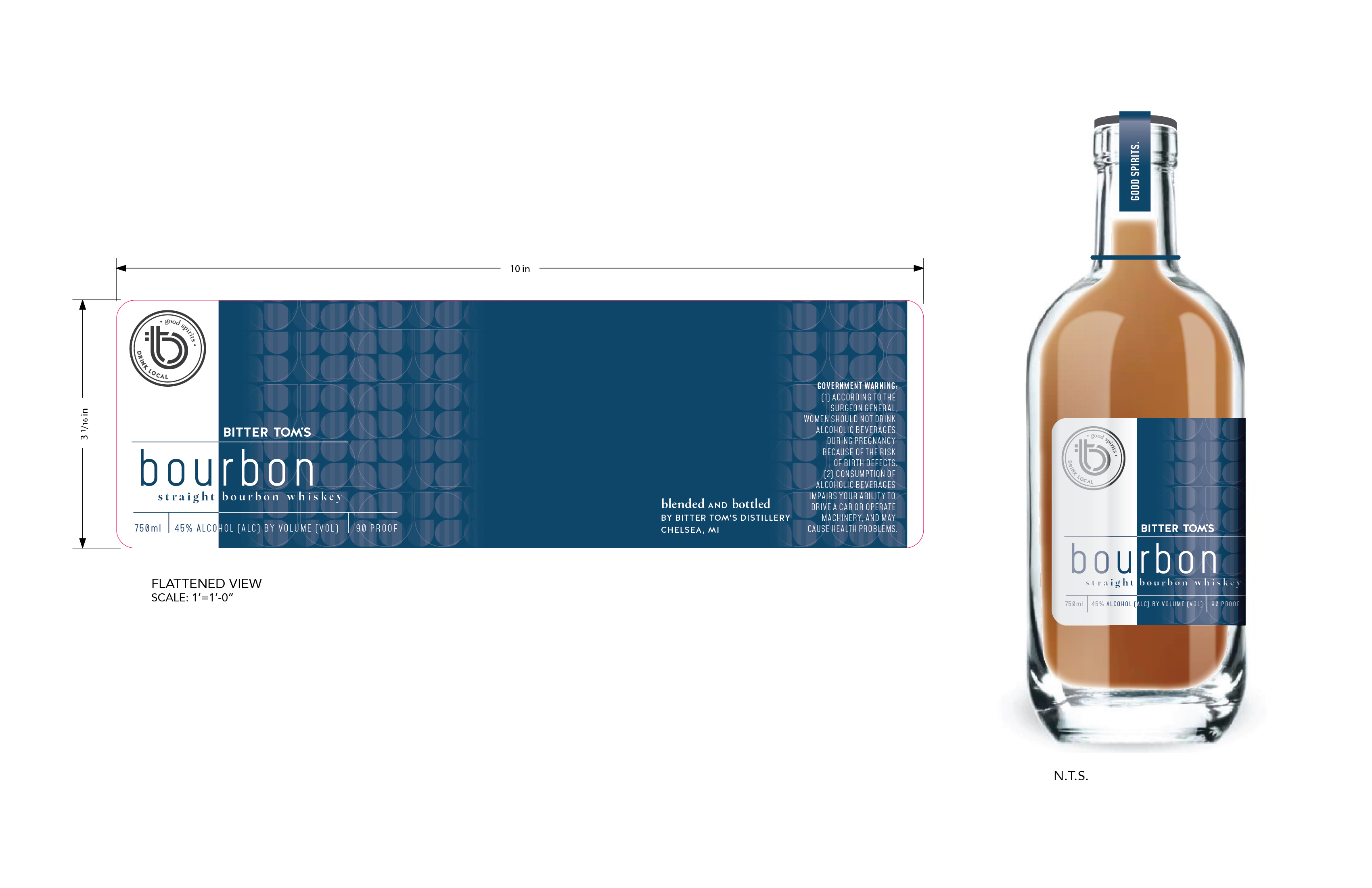
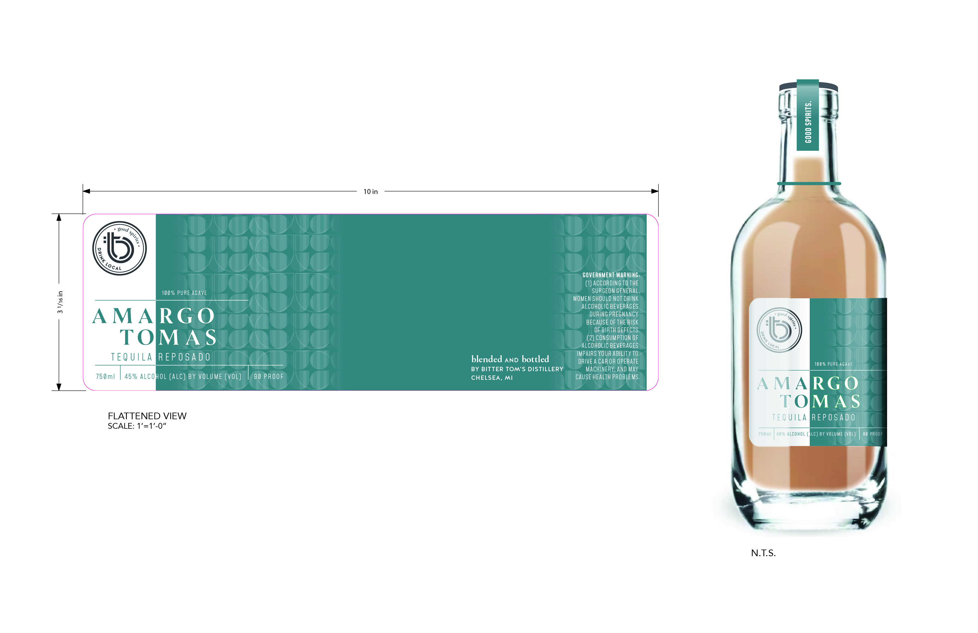
Working with the team at H2G Studio, I developed a label design for their new distribution strategy. This included creating a color palette across the full line of products and a design scheme that would differentiate them on the shelf.
